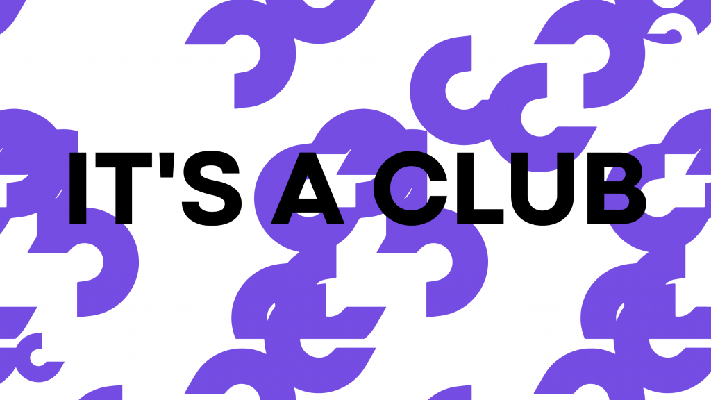
The same culture. A whole new mission. A whole new brand. Welcome to the club.
Aida Merino
THE SAME CULTURE. A WHOLE NEW MISSION. A WHOLE NEW BRAND. WELCOME TO THE CLUB.
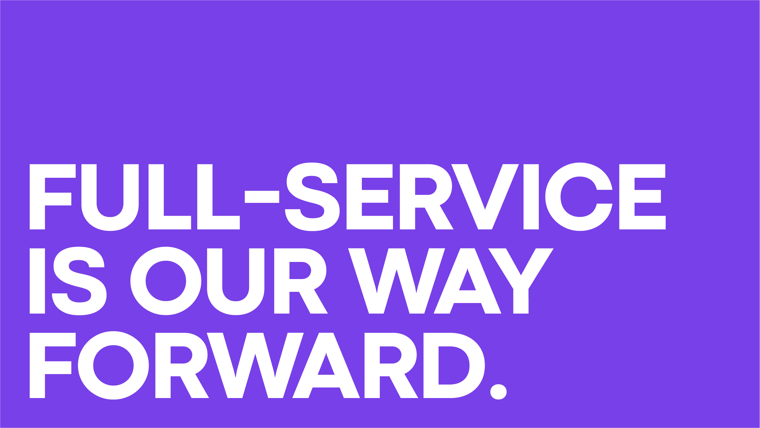
FULL-SERVICE IS OUR WAY FORWARD
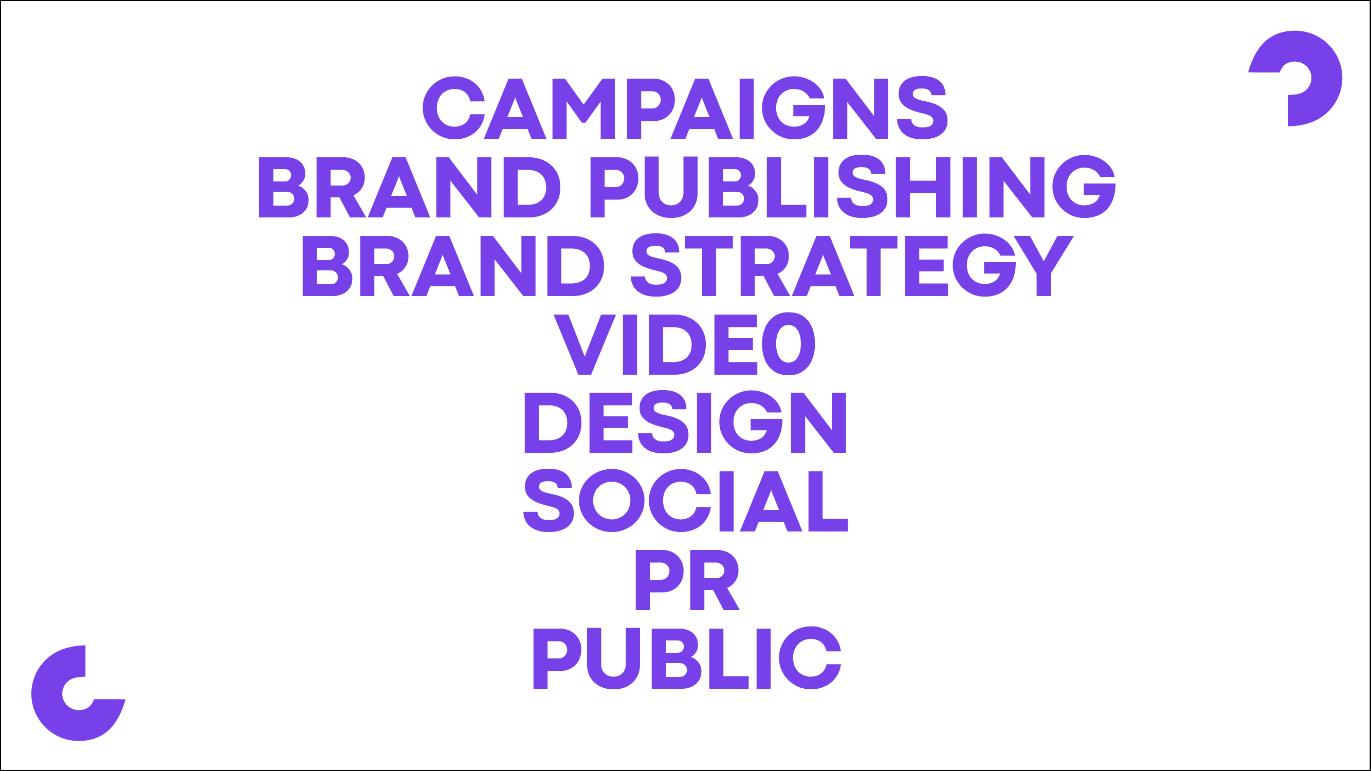
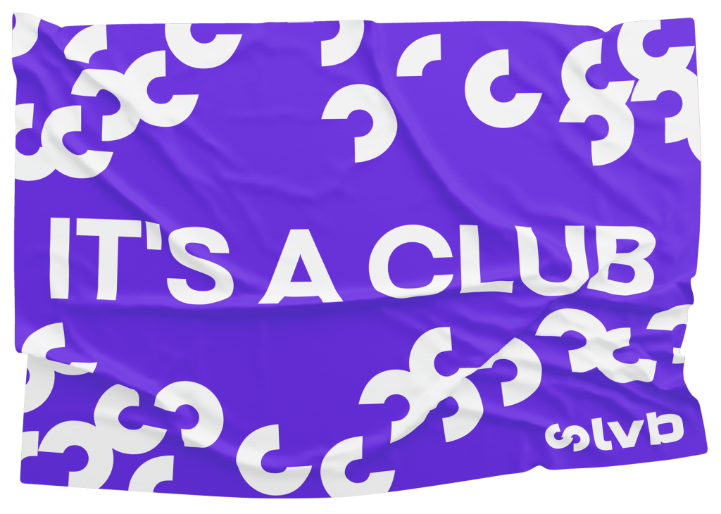
Facing a rebranding assignment always presents a big challenge. This time was not different, even more since this rebranding was also a major change for LVB. Taking the new big era, what we defined as THE TWENTIES, presented a great chance to give the company a new face-lift. The new era comes hand-in-hand with the structural reorganization for LVB, in order to meet the new market’s needs: a full-service agency model. This called for a brand redesign that visually integrated LVB’s specialized teams as well as the company’s characteristic brand culture: “it’s a club.”
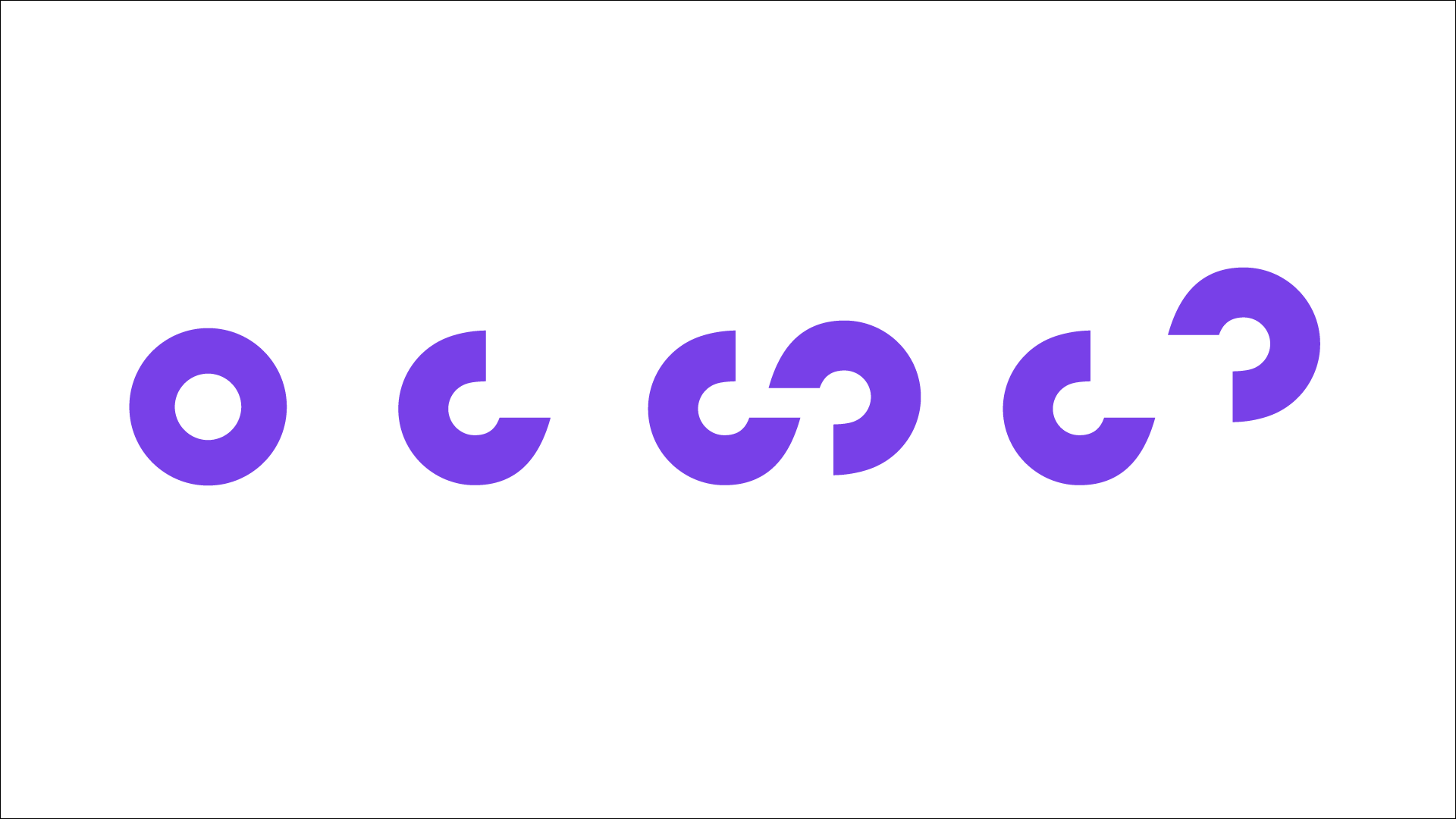
A SENSE OF BELONGING
That’s how the new brand’s symbol shaped up: the C from “club” as the main pilar the brand stands on. A symbol used to further develop a design system that creates a sense of belonging, allowing any future team to come to adhere to the brand. Further, the brand’s new look&feel leaves behind the darker and overloaded visuals to choose for an always clean, flat design. To that end, the old gradients from both the logo as well as the labels are replaced by one single color (“one color fits all”) and the chosen new font is a clean, geometric sans serif with multiple weights that offers great flexibility.
CLEANER THAN EVER
Another core change in line with this new strive for clean is our way of communicating. In all of our brand’s new communications, we look carefully at the whole picture and aim for a consistent style across channels. And our new golden rule: to showcase clients’ work cleaner than ever.
Welkom bij LVB. Op onze website maken we gebruik van cookies. Hiermee kunnen wij onder andere het functioneren van onze website verbeteren en webstatistieken bijhouden. Ook kunnen wij en derde partijen informatie verzamelen. Lees voor meer informatie ons Cookiebeleid, onder aan de pagina.